Core Focus

Component libraries
UI documentation
Design system governance

Best Fit For

  • Enterprise frontend teams
  • Multi-product ecosystems
  • Design system initiatives

Key Outcomes

  • Faster UI development
  • Consistent user interfaces
  • Improved developer collaboration

Integrates With

  • React / Next.js
  • Tailwind CSS
  • Design token systems
  • Drupal & WordPress & Headless Platforms

Frontend Development Becomes Hard to Scale

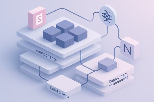
As digital platforms grow, frontend development often becomes fragmented across teams and repositories. UI components are duplicated, naming and API conventions drift, and interface behavior varies between products. Documentation is frequently outdated or scattered across wikis, tickets, and design files, making it difficult to understand what components exist, how they should be used, and which variants are supported.

When there is no reliable UI component documentation system, teams spend significant time rediscovering patterns, rebuilding the same UI elements, and reviewing inconsistencies late in the delivery cycle. This creates delivery bottlenecks, increases rework, and makes onboarding slower for new engineers and designers.

At enterprise scale, the lack of shared component documentation and governance increases operational risk. Changes to common UI patterns can introduce regressions across multiple applications, while inconsistent component implementations accumulate technical debt and raise maintenance overhead. Over time, the frontend becomes harder to evolve because teams cannot confidently standardize, validate, and reuse interface building blocks across the platform.

Our Storybook Implementation Approach

Component Audit

Analyze existing UI components and identify reusable patterns across applications.

Storybook Architecture

Design a scalable Storybook structure aligned with component libraries and design tokens.

Component Documentation

Document components with usage examples, configuration options, and development guidelines.

Integration With Frontend Stack

Connect Storybook with frameworks, build systems, and design system workflows.

Testing & Validation

Integrate visual testing and component validation into the development pipeline.

Governance & Maintenance

Establish processes to evolve the design system and maintain component consistency over time.

Core Storybook Capabilities

Storybook enables frontend documentation with Storybook by providing a structured environment to build, document, and validate UI components independently from application logic. It supports scalable component libraries with clear usage examples, states, and configuration patterns that improve discoverability and onboarding. For enterprise teams, it also strengthens UI component documentation and governance with Storybook by making standards visible, reviewable, and easier to maintain as the design system evolves.

What We Deliver
  • Storybook architecture and setup
  • Component library engineering
  • Design system documentation
  • Visual testing integration
  • Design token integration
  • Developer documentation platforms
Who This Is For
  • Storybook architecture and setup
  • Component library engineering
  • Design system documentation
  • Visual testing integration
  • Design token integration
  • Developer documentation platforms
Technology Stack
  • Storybook
  • React / Next.js
  • Tailwind CSS
  • Design Tokens
  • Chromatic / Visual Testing
  • NX / Monorepo architectures

Delivery Process

Our Storybook development services follow a clear engineering sequence from discovery through implementation and long-term evolution. We assess the current component landscape, define a scalable Storybook structure, and then implement React Storybook component documentation, testing, and governance workflows that fit the existing frontend architecture.

Delivery card for Discovery & Planning[01]

Discovery & Planning

We begin by assessing existing frontend implementations and identifying duplicated components, inconsistent interface patterns, and gaps in documentation. This discovery phase helps define the scope of the component system and establishes clear goals for the Storybook environment. The result is a structured plan for organizing reusable UI components, aligning them with the design system, and integrating them into the broader frontend architecture.

Delivery card for Component Library Development[02]

Component Library Development

Reusable UI components are engineered as modular building blocks that can be implemented across multiple applications. Each component is structured with clear APIs, configurable states, and predictable behavior. These components are then integrated into Storybook where teams can explore variations and understand usage patterns. This step establishes the foundation of a scalable component library.

Delivery card for Documentation & Governance[03]

Documentation & Governance

Every component is documented with interactive examples, configuration options, and usage guidelines. Storybook becomes the central reference environment where developers and designers can review component behavior and validate implementation patterns. Governance practices are also introduced to ensure new components follow established standards and the system evolves consistently.

Delivery card for Integration & Automation[04]

Integration & Automation

Storybook is integrated into the existing frontend ecosystem including build pipelines, testing frameworks, and development workflows. Automated processes ensure components can be validated, versioned, and deployed reliably as part of the development lifecycle. This integration allows teams to maintain consistent UI behavior while accelerating delivery across projects.

Delivery card for Validation & QA[05]

Validation & QA

Component validation ensures that UI elements remain stable across environments and updates. Visual regression testing and automated verification tools detect unintended interface changes before they reach production. This step protects the consistency of the design system while reducing the risk of regressions in complex frontend applications.

Delivery card for Continuous Evolution[06]

Continuous Evolution

Design systems and component libraries must evolve as products grow. Governance workflows and versioning strategies allow teams to introduce improvements while maintaining stability for existing applications. Storybook provides a structured environment where components can be refined, extended, and adopted gradually across the platform.

Business Outcomes

Storybook design system engineering improves delivery speed and reduces risk by standardizing how UI components are built, documented, and validated. Teams spend less time recreating interface elements, can onboard faster using a shared UI component Storybook library, and catch regressions earlier through consistent documentation and testing workflows. Over time, this reduces technical debt and helps organizations scale frontend development across multiple teams and applications with more predictable UI quality.

Faster UI Development

Reusable components reduce development time.

Consistent User Experience

Shared components ensure design consistency.

Improved Collaboration

Designers and developers work from the same component system.

Reduced Technical Debt

Structured component architecture simplifies maintenance.

Scalable Frontend Architecture

Design systems support growth across multiple applications.

Higher Development Quality

Testing and documentation reduce UI regressions.

Related Services

Design systems and component libraries often connect with frontend architecture, headless platforms, and modern DevOps workflows. These related services help organizations build scalable digital platforms with consistent user interfaces.

Frequently Asked Questions

Storybook is often introduced as a documentation tool, but in enterprise environments it becomes a central part of frontend architecture and design system governance. When implemented correctly, it supports reusable component development, structured collaboration between designers and engineers, and reliable UI testing workflows. These questions address common technical, operational, and strategic considerations that organizations evaluate when adopting Storybook as part of a scalable design system and frontend engineering platform.

How does Storybook support scalable design systems?

Storybook provides a structured environment where UI components can be developed, documented, and validated independently from the application itself. Instead of embedding interface logic directly into page templates or product code, teams can isolate components and organize them into a reusable system. This approach is essential for enterprise design systems. Each component becomes a documented building block with clear usage guidelines, variations, and states. Designers and engineers can collaborate around the same component definitions, ensuring consistency across applications and digital products. Over time, Storybook becomes the operational center of the design system. It supports governance, improves discoverability of components, and reduces duplication across codebases. Organizations managing multiple applications, brands, or frontend teams benefit significantly from this centralized component architecture.

Can Storybook be introduced into an existing frontend project?

Yes. Storybook can be integrated into most existing frontend projects without requiring a complete architectural rewrite. In many cases, organizations introduce Storybook gradually while auditing their current component structure. The process typically begins with identifying reusable UI components across the codebase. These components are then extracted and documented inside Storybook while maintaining compatibility with the application’s existing framework and build system. Over time, teams can transition from ad-hoc UI development toward a structured component library. This incremental approach allows organizations to improve frontend architecture while continuing product development. It also helps reduce technical risk because the application itself does not need to be rebuilt during the transition.

How does Storybook improve collaboration between designers and developers?

One of the main challenges in frontend development is the disconnect between design documentation and implemented code. Designers often work in tools like Figma while developers work inside application repositories, which can lead to inconsistencies and interpretation gaps. Storybook acts as a shared reference point. Each UI component is presented with interactive examples that show how it behaves across different states and configurations. Designers can review component behavior directly, while developers gain clear implementation guidelines. This shared documentation layer significantly reduces ambiguity. Teams can discuss components using a common visual reference instead of screenshots or static design files. Over time, this improves design fidelity, accelerates UI reviews, and creates a more reliable collaboration process across product teams.

Can Storybook support visual testing and UI quality control?

Yes. Storybook integrates well with visual testing tools that compare component rendering across builds. These tools capture visual snapshots of components and detect unintended changes during development. This is particularly valuable in large frontend systems where small UI changes can affect multiple pages or applications. Automated visual testing ensures that design system components remain consistent even as the platform evolves. By integrating visual regression testing into CI/CD pipelines, teams can identify issues early in the development process. This reduces the risk of UI regressions reaching production and improves overall frontend reliability. Many organizations treat Storybook as a foundation for UI testing workflows rather than only a documentation environment.

How does Storybook fit into modern frontend architecture?

In modern frontend ecosystems, applications are often built from reusable components rather than large monolithic page templates. Storybook supports this architectural model by allowing teams to develop and validate components in isolation. Instead of testing components only within the context of the application, developers can explore them independently in Storybook. This improves component reliability and reduces dependencies between UI elements. Storybook also integrates well with modern frontend frameworks and build systems. It can operate alongside React, Next.js, and other frameworks commonly used in enterprise platforms. As a result, it becomes a core part of the frontend architecture, supporting documentation, development workflows, and design system governance.

Can Storybook work within monorepo architectures?

Storybook works well in monorepo environments where multiple applications share a common component library. In these setups, components are typically maintained in shared packages while individual applications consume them as dependencies. Storybook can serve as the documentation and testing environment for these shared components. Developers can explore the entire component library in one place, regardless of which application ultimately uses the components. This approach is particularly effective for organizations managing multiple products or frontend teams. By combining monorepos with Storybook documentation, teams can maintain consistent UI patterns across projects while avoiding duplicated component implementations.

How do you govern a design system built with Storybook?

Governance is a critical aspect of maintaining a healthy design system. Storybook helps by providing a centralized location where all components are documented and reviewed. However, governance also requires clear processes. Teams typically define component contribution guidelines, review workflows, and versioning strategies for shared UI libraries. Storybook becomes the reference point where these components are documented and validated. Over time, organizations may establish a design system team responsible for approving new components and maintaining standards. This ensures the system evolves in a controlled way while still supporting innovation across product teams.

Can a Storybook design system support multiple digital platforms?

Yes. Storybook-based design systems are commonly used across multiple applications, websites, and digital platforms. Because components are documented independently from the application, they can be reused in different environments. For example, a component library built in Storybook might be used across marketing websites, product dashboards, and mobile-friendly web applications. As long as these platforms share compatible frontend technologies, the components can remain consistent. This multi-platform capability is one of the reasons design systems have become essential for large organizations. Instead of rebuilding UI patterns for every product, teams rely on a centralized component library that evolves alongside the platform ecosystem.

Does implementing Storybook improve development speed?

In most cases, yes. Storybook improves development speed by reducing duplication and providing a clear component reference library. When developers can reuse documented components instead of recreating interface elements, new features can be delivered faster. Teams also spend less time debugging UI inconsistencies because components are tested independently before integration into applications. Over time, the efficiency gains become more significant. As the component library grows, developers rely on existing patterns rather than building new ones. This allows organizations to maintain high UI quality while accelerating delivery across multiple products.

What is the typical process for starting a Storybook implementation?

A Storybook implementation usually begins with a frontend architecture review. This includes analyzing existing UI components, identifying duplication across projects, and evaluating how components are currently documented. Based on this analysis, teams define the structure of the component library and establish the initial Storybook environment. Core UI elements such as buttons, forms, navigation patterns, and layout components are often documented first. Once the foundation is in place, the component library gradually expands as new features are developed. The goal is to ensure that future UI development relies on reusable building blocks instead of ad-hoc component implementations.

What does a typical engagement look like for Storybook development?

Engagements typically start with a discovery phase where the current frontend architecture and component landscape are evaluated. This assessment helps determine whether a design system already exists informally within the codebase. Based on the findings, a structured implementation plan is created. This plan may include component extraction, design system architecture, Storybook setup, documentation standards, and integration with development pipelines. Organizations may adopt Storybook as part of a focused design system initiative or integrate it gradually into ongoing frontend development. The engagement model is flexible and can support both short architecture sprints and long-term design system evolution.

Storybook-Driven UI Consistency and Scalable Design Systems

These case studies showcase the practical application of Storybook as a foundational tool for building and governing scalable component libraries and design systems. They highlight how reusable UI components and structured workflows enable consistent frontend delivery, improve collaboration between design and development teams, and support long-term platform scalability and governance.

What Clients Say

Further reading on Storybook governance

These articles expand on the architecture and governance decisions that make Storybook and component libraries scale across teams. They cover design token alignment, component ownership, adoption, and the contract between frontend components and the broader platform. Together they provide practical context for building a maintainable, governance-ready UI documentation and delivery workflow.

Build a Scalable Component System

Let’s design a reusable component library and Storybook documentation system tailored to your frontend architecture.

Oleksiy (Oly) Kalinichenko

Oleksiy (Oly) Kalinichenko

CTO at PathToProject

Do you want to start a project?