Fragmented UI Development Slows Platform Growth
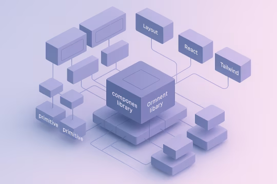
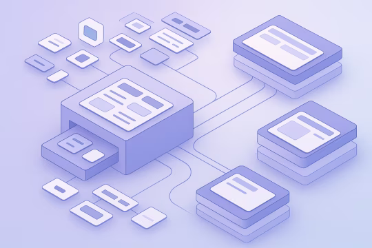
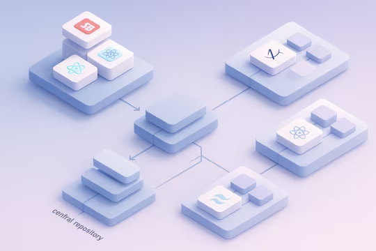
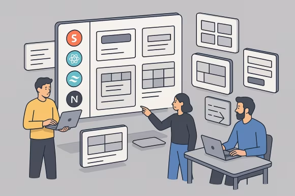
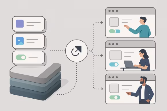
As digital platforms grow, frontend teams often duplicate UI components across projects and repositories. Interface elements such as buttons, navigation patterns, forms, and layouts are implemented multiple times with slight variations. Over time, this fragmentation creates inconsistent user experiences, increases maintenance complexity, and makes it harder to enforce design system components consistently across products.
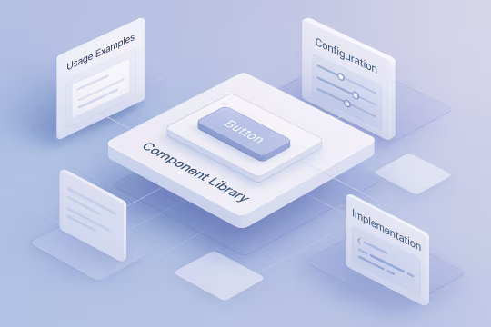
Without a scalable UI component library, teams accumulate parallel implementations with different APIs, styling approaches, and accessibility assumptions. Design updates and brand changes must be applied repeatedly across codebases, which slows delivery and increases regression risk. Documentation and usage guidance also tend to drift or become scattered across tools, making onboarding harder and creating uncertainty about which patterns are approved for enterprise frontend platforms.
As the number of applications and contributors increases, the interface layer becomes an operational bottleneck: dependency boundaries blur, architectural inconsistencies spread, and small UI changes require coordination across multiple repositories. The result is higher long-term cost, slower iteration, and elevated risk when modernizing frontend frameworks or evolving shared interaction patterns.


 [01]
[01]