A design system can begin with strong accessibility foundations and still become unreliable over time.
That pattern is common in enterprise environments, especially across multi-brand platforms. The core library may have been audited. The base components may have sensible semantics, keyboard support, focus states, and contrast-tested tokens. Storybook examples may even demonstrate correct usage. Yet six months or a year later, teams start finding inconsistent behaviors across brands, products, and channels.
The problem is not usually that accessibility was ignored from the beginning. It is that the system changed faster than its controls matured.
This is what design system accessibility drift looks like in practice: the tested baseline remains documented, but the version actually shipped across brands and implementations no longer behaves like that baseline in a predictable way.
In enterprise delivery, drift is rarely caused by a single bad decision. It typically emerges through accumulation:
- component variants multiply faster than they are reviewed
- token overrides introduce contrast or state inconsistencies
- wrapper components change interaction patterns
- downstream teams bypass intended contracts
- QA validates product flows but not shared component integrity
- releases prioritize speed over regression visibility
For design system leads and platform owners, this means accessibility must be treated as an ongoing system property, not as a launch milestone.
Why accessibility drift appears after the first successful rollout
The first design system rollout usually benefits from focus.
A small group defines the initial components, aligns on standards, reviews patterns carefully, and validates common use cases. At this stage, the system is compact enough for quality to feel manageable. Teams can inspect the whole surface area.
Drift tends to begin after adoption succeeds.
That may sound counterintuitive, but success changes the operating conditions:
- more brands adopt the system
- more product teams request tailored behavior
- more delivery teams contribute code
- more deadlines encourage local exceptions
- more variants are introduced to avoid breaking existing implementations
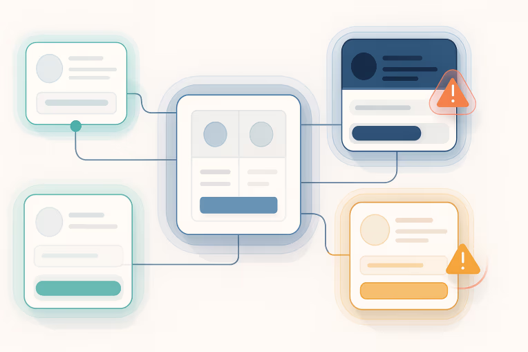
The system becomes less like a library and more like a distributed product platform. Once that happens, accessibility risk moves from the component itself to the relationships around it: tokens, wrappers, documentation, contribution processes, and release discipline.
In multi-brand design systems, this is intensified by the legitimate need for variation. Brands may have different visual identities, content patterns, localization requirements, editorial styles, and market constraints. Variation is not the problem by itself. The problem is unmanaged variation.
A button component may have started with one accessible implementation. Over time it can split into:
- multiple hierarchy levels
- brand-specific color mappings
- compact and dense variants
- icon-only options
- loading and disabled states
- link-button hybrids
- framework-specific wrappers
Each variation may appear reasonable when reviewed in isolation. But the total interaction surface can become difficult to test and govern consistently. That is the moment when teams still say, "the component is accessible," while users increasingly encounter uneven outcomes.
The platform patterns that create drift: variants, overrides, wrappers, and inconsistent implementation
Accessibility drift is usually introduced through recurring platform patterns rather than obvious defects.
The first is variant growth without hard boundaries.
Variants often begin as a convenience for reuse. Eventually, they become a substitute for decision-making. Instead of asking whether a new need fits the component's intended contract, teams add another size, state, theme, density mode, or layout option. That expansion increases the number of combinations that must preserve semantics, focus behavior, contrast, hit area, motion settings, and assistive technology compatibility.
When component APIs become too permissive, accessibility quality becomes probabilistic.
The second pattern is token-layer drift.
Enterprise teams often separate global tokens, semantic tokens, and brand tokens. That structure is useful, but it can conceal risk when brand overrides are allowed to alter states that carry accessibility meaning.
For example, teams may safely theme neutral surfaces and text styles, but create trouble when brand mappings affect:
- focus ring visibility
- interactive state contrast
- disabled state legibility
- status color meaning
- link differentiation from body text
- error and success indicators
The system may still be token-driven, but that alone does not make it safe. Tokens need constraints. If semantic intent is not preserved across brand overrides, accessible behavior can degrade without any component code changing.
The third pattern is wrapper components that weaken the baseline.
This is one of the most common enterprise failure modes. A product team adopts a shared component but wraps it with local logic, styling hooks, tracking attributes, routing adapters, or layout assumptions. The wrapper may seem harmless, yet it can modify DOM structure, suppress labels, interfere with focus order, or replace native behavior with scripted behavior.
Examples include:
- turning a semantic button into a clickable container
- replacing an anchor with a router abstraction that drops accessible naming or target expectations
- injecting icons without preserving text alternatives
- moving helper text or error text outside the expected relationship to the control
- trapping focus unintentionally inside overlays or drawers
From the design system team's perspective, the core component still passes. From the user's perspective, the shipped experience does not.
The fourth pattern is inconsistent implementation across frameworks or channels.
Many enterprise platforms support multiple frontend stacks, legacy applications, or migration states. A design system may offer React components, web components, Figma specifications, CSS foundations, and coded patterns for different delivery teams. That broad support is often necessary, but it creates multiple places where accessible behavior can diverge.
If one implementation preserves keyboard interaction and another only matches the visual design, the design system brand remains consistent while the accessibility baseline does not.
The fifth pattern is documentation that describes usage but not obligations.
Teams often publish component guidance, but not enough implementation constraints. Good docs explain more than appearance and props. They define what consumers must not change, which variant combinations are unsupported, which accessibility behaviors are guaranteed by the component, and which remain the consumer's responsibility.
Without that clarity, teams fill in the blanks differently.
Where ownership usually breaks between design, engineering, QA, and product teams
Accessibility drift is fundamentally an ownership issue.
Not because nobody cares, but because enterprise workflows distribute responsibility in ways that make failures easy to normalize.
Design may assume the coded component enforces the behavior.
Engineering may assume the design system already validated the pattern.
QA may assume shared components are covered upstream.
Product may assume accessibility is a release checklist item rather than a platform health concern.
Those assumptions create gaps in exactly the places where drift occurs.
A common breakdown looks like this:
- Design system team owns the core component library and reference guidance
- Brand or experience design teams own visual customization and pattern extensions
- Application teams own local assembly, wrappers, and product-specific workflows
- QA teams own scenario validation within release scope
- Platform governance or architecture owns standards, but not day-to-day enforcement
In theory, this is manageable. In practice, it often leaves no single team accountable for the integrity of the end-to-end accessible experience once the component leaves the core library.
That is why mature teams define accessibility ownership at multiple layers:
- design system responsibility for baseline component behavior and documented contracts
- consumer responsibility for correct composition, content, and context-specific usage
- brand responsibility for token mappings and approved visual exceptions
- release responsibility for regression detection before changes ship
This layered ownership matters because accessibility is not contained within a component API. A component can provide structure, but meaningful labels, content order, validation messaging, and interaction context often depend on product implementation decisions.
If no one explicitly owns those seams, drift becomes invisible until users report it or audits rediscover it late.
Controls that keep the baseline trustworthy: contracts, audits, story coverage, and release checks
The goal is not to eliminate all variation. The goal is to make the trusted baseline explicit and durable.
That requires controls that operate continuously, not just at library launch.
The first control is a component contract.
A component contract should define:
- the semantic role and intended usage
- supported variants and prohibited combinations
- required content or labeling expectations
- keyboard and focus behavior the component guarantees
- token dependencies that must remain stable
- consumer responsibilities for composition and context
- known edge cases that require review before use
This moves documentation from descriptive to enforceable. It also helps platform and QA teams distinguish between supported customization and unsupported modification.
The second control is story coverage that reflects real variability.
Storybook or equivalent tooling is useful only if it exercises the combinations that actually create risk. Teams often maintain beautiful reference stories but omit the variant intersections most likely to drift.
Useful coverage usually includes:
- all interactive states
- keyboard navigation paths
- high-density or compact layouts
- long labels and localized content
- icon-only and mixed-content cases
- validation and helper text states
- theme or brand token permutations
- dark or alternative surface contexts where relevant
The point is not to produce infinite permutations. It is to cover the combinations most likely to break semantics, contrast, focus visibility, or state communication.
The third control is automated accessibility checks in the contribution workflow.
Automation will not prove accessibility quality, but it can help detect regression quickly and consistently. At the design system layer, this often means including checks in pull requests, visual review environments, and release pipelines so contributors see failures before they spread downstream.
This works best when automation is scoped realistically:
- catch repeatable issues early
- fail builds on agreed high-confidence regressions
- surface warnings for patterns that need human review
- tie results to component stories and changed surfaces
The fourth control is periodic manual audits at the system level.
Automation alone is not enough because many accessibility issues emerge from interaction design, naming, content relationships, or complex states. Periodic audits should focus on the shared patterns most likely to affect many products at once.
For example, teams may periodically review:
- navigation primitives
- form controls and validation patterns
- modal, drawer, and overlay behaviors
- tables and data-heavy components
- rich text and editorial blocks
- cross-brand token mappings for critical states
These reviews do not need to be framed as legal certification. Their purpose is to preserve trust in the baseline and to identify drift before it becomes normalized.
The fifth control is release gating tied to shared component change risk.
Not every release needs the same level of scrutiny. But teams should distinguish low-risk cosmetic changes from changes that affect semantics, structure, focus handling, interaction models, or token mappings with accessibility impact.
A practical release check can ask:
- Did the DOM structure change?
- Did semantic elements or ARIA usage change?
- Did focus order, trapping, or restoration change?
- Did any token affecting interactive state, contrast, or visibility change?
- Did variant behavior expand?
- Did consumer-facing guidance change?
When those answers are yes, review depth should increase.
How to handle brand-specific exceptions without fragmenting the system
Brand-specific exceptions are unavoidable in multi-brand platforms. The challenge is allowing necessary expression without turning the design system into a collection of loosely related forks.
A good starting point is to separate brand expression from interaction integrity.
Brand expression can often vary safely through constrained token layers, typography choices, spacing scales, illustration systems, and selected visual treatments. Interaction integrity should be much harder to override. That includes focus treatments, control structure, accessible naming patterns, state communication, and keyboard behavior.
In practice, that means some decisions should remain centrally governed even when visual identity changes.
Useful patterns include:
- defining non-negotiable semantic and interaction requirements for shared components
- limiting which semantic tokens brands can remap freely
- requiring review for overrides affecting critical states or indicators
- documenting approved exception patterns rather than allowing ad hoc divergence
- keeping exception logic visible in the same repository or governance process as the core system
Another strong practice is to treat exceptions as tracked deviations, not silent customizations.
A tracked deviation typically includes:
- the business reason for the exception
- the brands or products affected
- the accessibility risks considered
- the implementation boundary of the change
- whether the exception is temporary, experimental, or permanent
- the review owner and expiration or reassessment date
This helps teams avoid a common anti-pattern: a one-off brand need becomes a permanent undocumented behavior that later appears elsewhere without its original context.
It is also important to resist pushing every exception down into the core API. Sometimes the right answer is not a new variant, but a reviewed composition pattern outside the base component. Expanding the core library should require evidence that the need is broadly repeatable and can be supported without weakening the contract.
Metrics and review rituals for keeping accessibility visible over time
If accessibility is not made visible in operating rhythms, drift will usually return.
That visibility does not require vanity metrics or speculative compliance scores. It requires a small number of signals that help teams see where trust in the system is strengthening or weakening.
Useful metrics often include:
- number of shared components with current accessibility contract documentation
- percentage of high-usage components covered by automated checks and representative stories
- count of open accessibility-related regressions in the design system backlog
- number of approved brand exceptions and how many are overdue for review
- time to review or remediate regressions affecting shared components
- proportion of component changes classified as accessibility-impacting and reviewed accordingly
These metrics are most valuable when tied to governance conversations rather than dashboards alone.
Good review rituals can include:
- component change review for any update affecting semantics, focus, state communication, or token mappings
- cross-functional triage where design, engineering, and QA review recurring regressions together
- brand override review for new token mappings or major visual deviations
- quarterly baseline checks for high-risk shared patterns used across multiple products
- consumer feedback loops so product teams can report where the documented component contract breaks down in real use
These rituals help move accessibility out of the category of "special review" and into normal platform operations.
That shift matters. When accessibility is only discussed during audits or escalations, teams treat it as an exception. When it is embedded into contribution review, release checks, and portfolio governance, it becomes part of how the platform defines quality.
A practical operating model for reducing design system accessibility drift
For enterprise teams, the most effective response is usually operational, not rhetorical.
A practical model often looks like this:
- Define the baseline clearly. Document component contracts, token constraints, and consumer responsibilities.
- Constrain variation intentionally. Allow approved flexibility, but make high-risk overrides hard to introduce casually.
- Test the combinations that actually occur. Cover variant intersections, brand permutations, and real implementation contexts.
- Review changes by risk, not by habit. Increase scrutiny for structural, semantic, and interaction-affecting changes.
- Track exceptions visibly. Treat deviations as governed decisions with owners and review dates.
- Create recurring governance rhythms. Use audits, triage, and release reviews to keep accessibility present over time.
The key insight is simple: accessibility drift in multi-brand design systems is rarely a sign that the original component library failed. More often, it shows that the operating model around the library did not mature at the same pace as adoption.
When enterprise teams recognize that, the work becomes clearer. The task is not just to build accessible components once. It is to preserve accessibility as the system expands through brands, products, frameworks, and release cycles.
That requires governance, contribution discipline, and technical boundaries that keep the baseline trustworthy. Without those controls, variant growth quietly erodes quality. With them, design systems can support brand flexibility and scalable delivery without losing confidence in the experience users actually receive.
Teams working through this in practice often see the same pattern in multi-brand content platforms, where Storybook governance and shared UI rules help keep variant growth from turning into delivery inconsistency.
Tags: design system accessibility drift, multi-brand design systems, accessibility governance, component variants, WCAG compliance, design system operations, frontend accessibility architecture, enterprise digital platforms, design systems